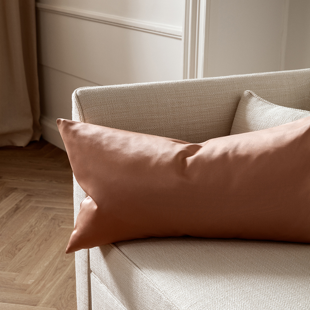
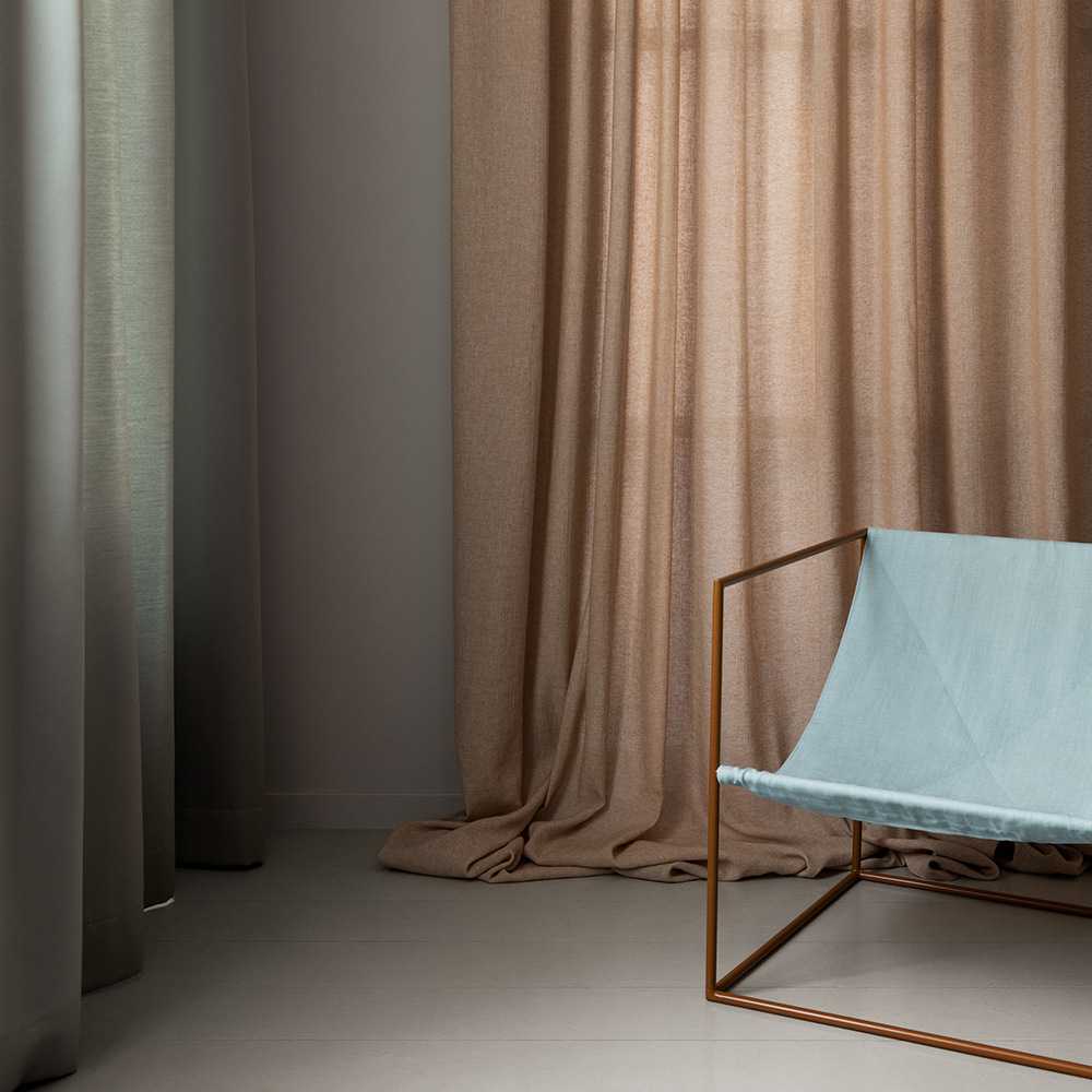
Cold and warm tones create a perfect balance
Burnt caramel paired with blue is a great example of how warm and cool colours can harmonize. Understanding the interaction of colours is essential to the design process, whether in product or interior design. We love experimenting with the contrast between yarns and fabrics, just as we enjoy the interplay of matte and shiny finishes.
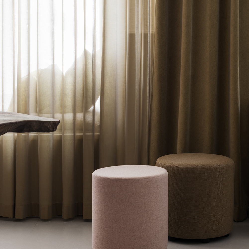
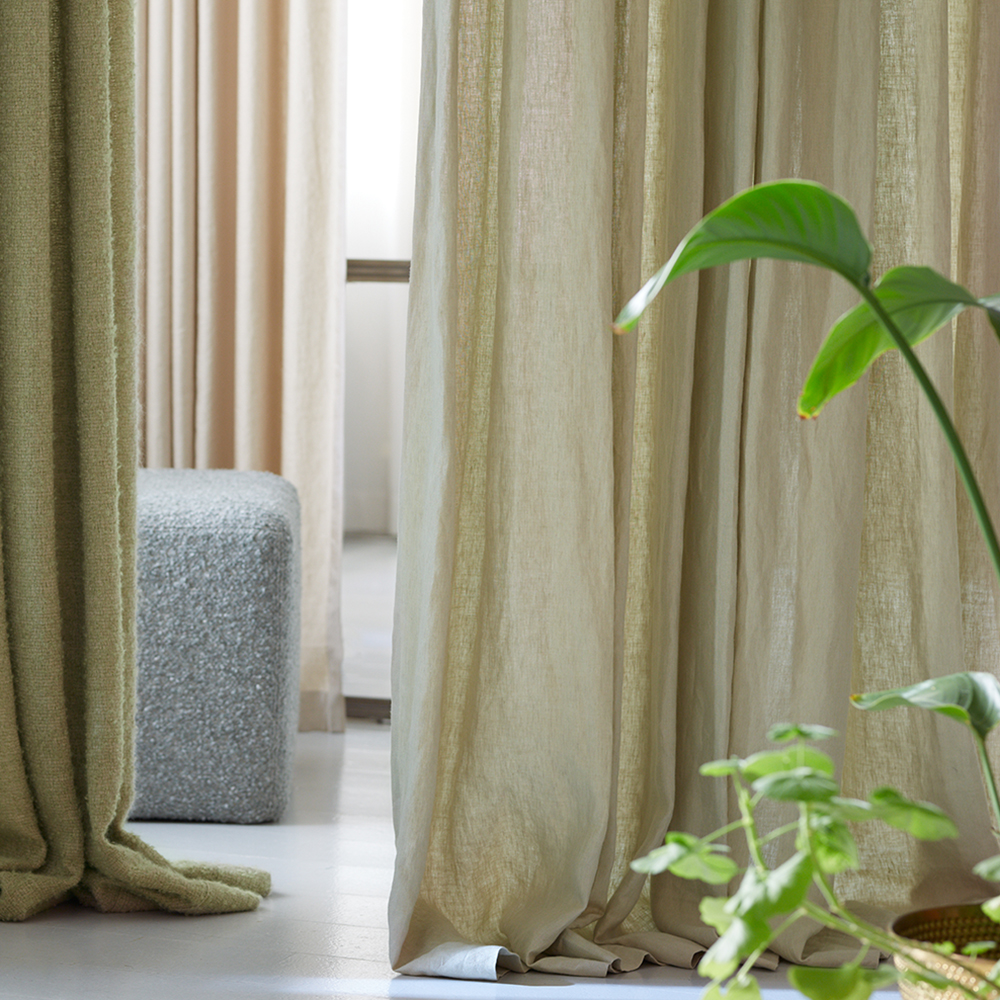
Ripasso, Levanto, Malva, Savona, California, and Kiwi are distinct from one another, but their contrasts create beautiful combinations—showcasing how we love to create.