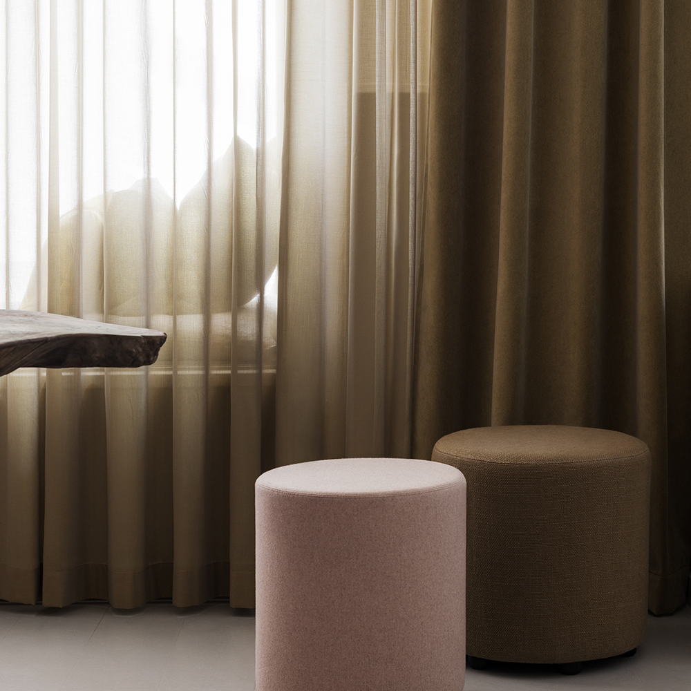
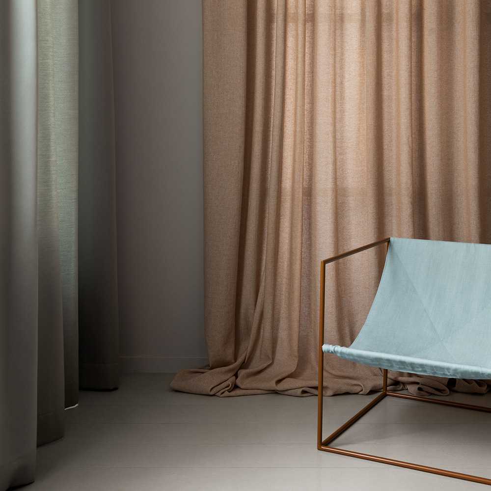
Contrasting Colours in Harmonious Hues
We love to create contrast while maintaining harmony, and the combination of muted green and muted pink is one of our favourites.
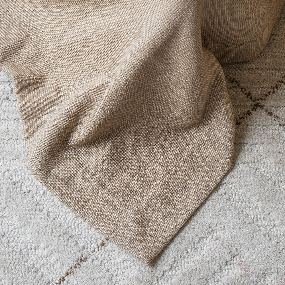
Using the same hue in different colours is a popular technique for designing a balanced interior. This approach creates a soft and cohesive atmosphere. Incorporating diverse materials and textures—such as wool and linen, structured and smooth finishes—adds depth. The pixelated texture of Levanto contrasts beautifully with the even, woolly surface of Ripasso, while the patterned matte Moritz complements the glossier finish of California.